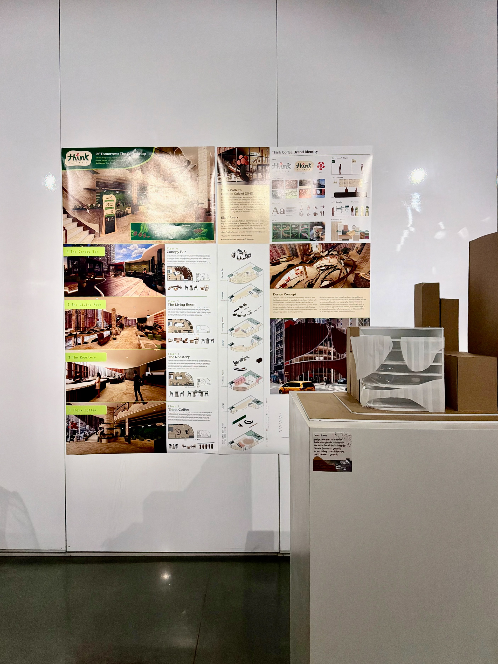
This project served as my capstone project for my time in school. Instead of a traditional solo capstone, this was in the form of an interdisciplinary studio. The studio was split into two halves, the first, a solo research project, the second was designing a cafe in a team of six, set 15 years ahead into the future. I worked with three interior designers, an architect, and one other graphic designer to deliver this flagship coffee shop design over the course of eight weeks.
Studio
Iowa State University College of Design
Of Tomorrow: The Coffeeshop
Professors Yongyeon Cho & Brandon Olsen
Of Tomorrow: The Coffeeshop
Professors Yongyeon Cho & Brandon Olsen
Team
Paige Brennan (Interior)
Mckayla Henrichs (Interior)
Hala Elmughrabi (Interior)
Orion Osbey (Architecture)
Trevor Jensen (Graphic)
Sam Pease (Graphic)
Mckayla Henrichs (Interior)
Hala Elmughrabi (Interior)
Orion Osbey (Architecture)
Trevor Jensen (Graphic)
Sam Pease (Graphic)
Concept
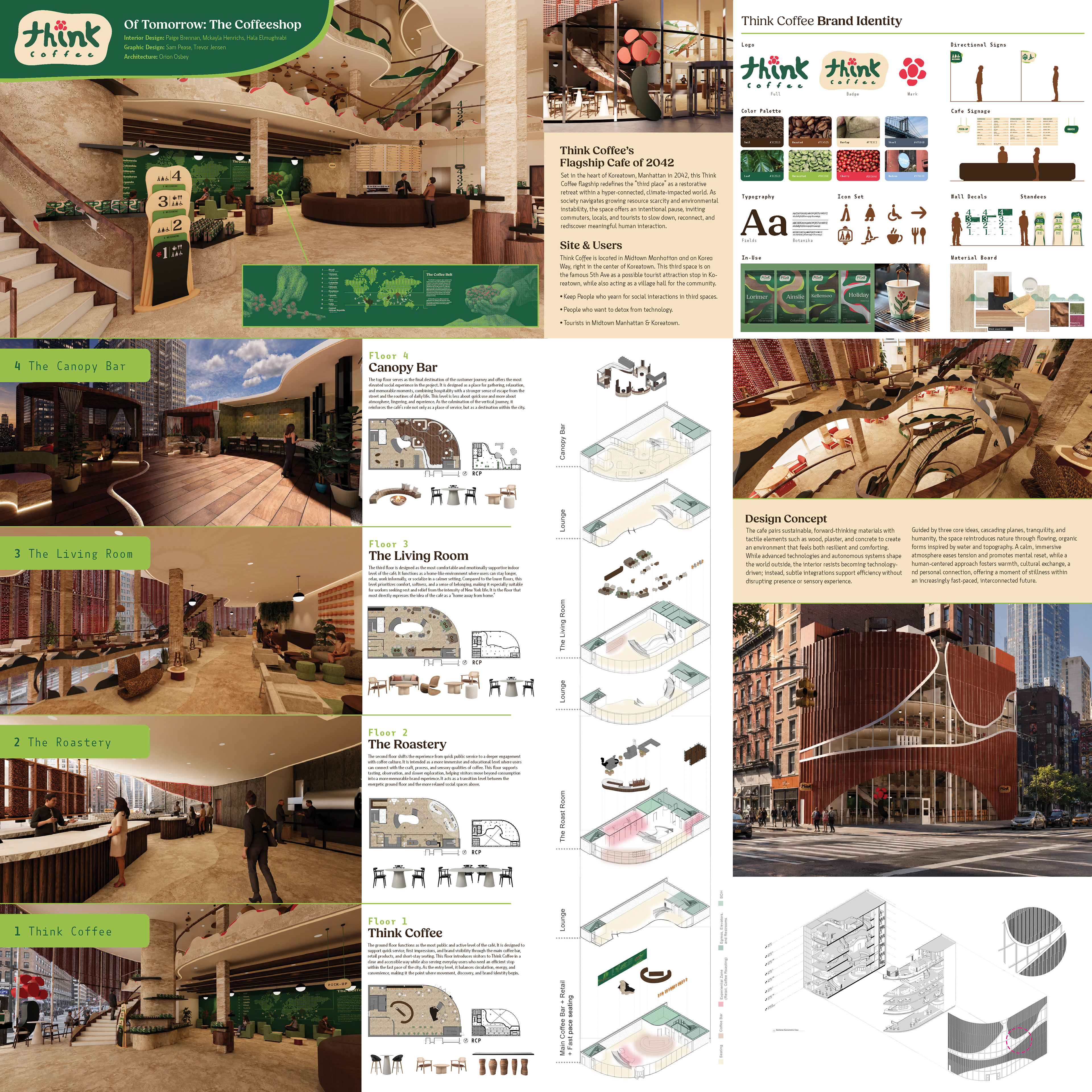
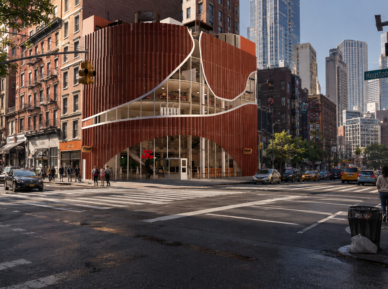
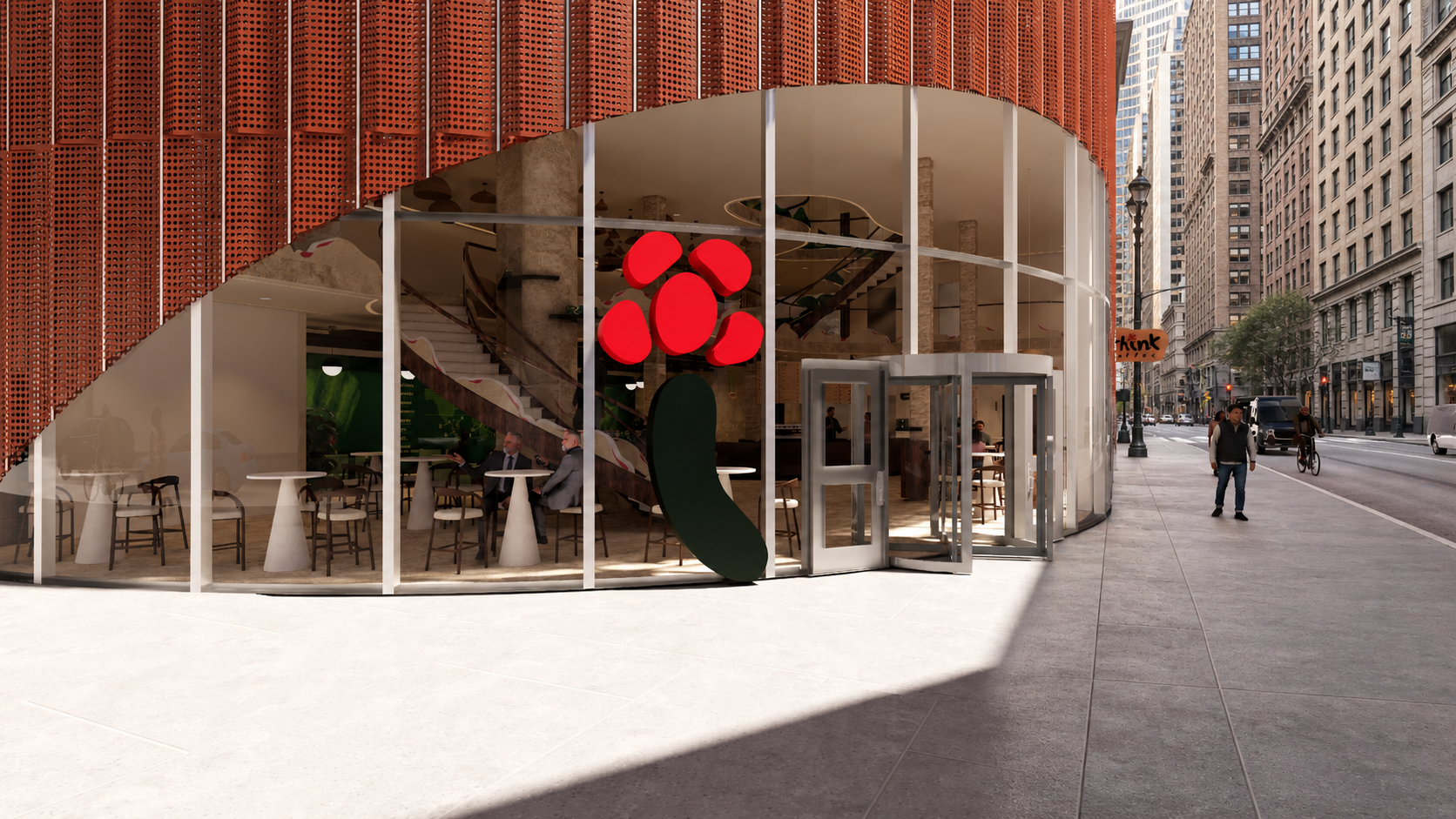
Think Coffee's Flagship Cafe of 2042
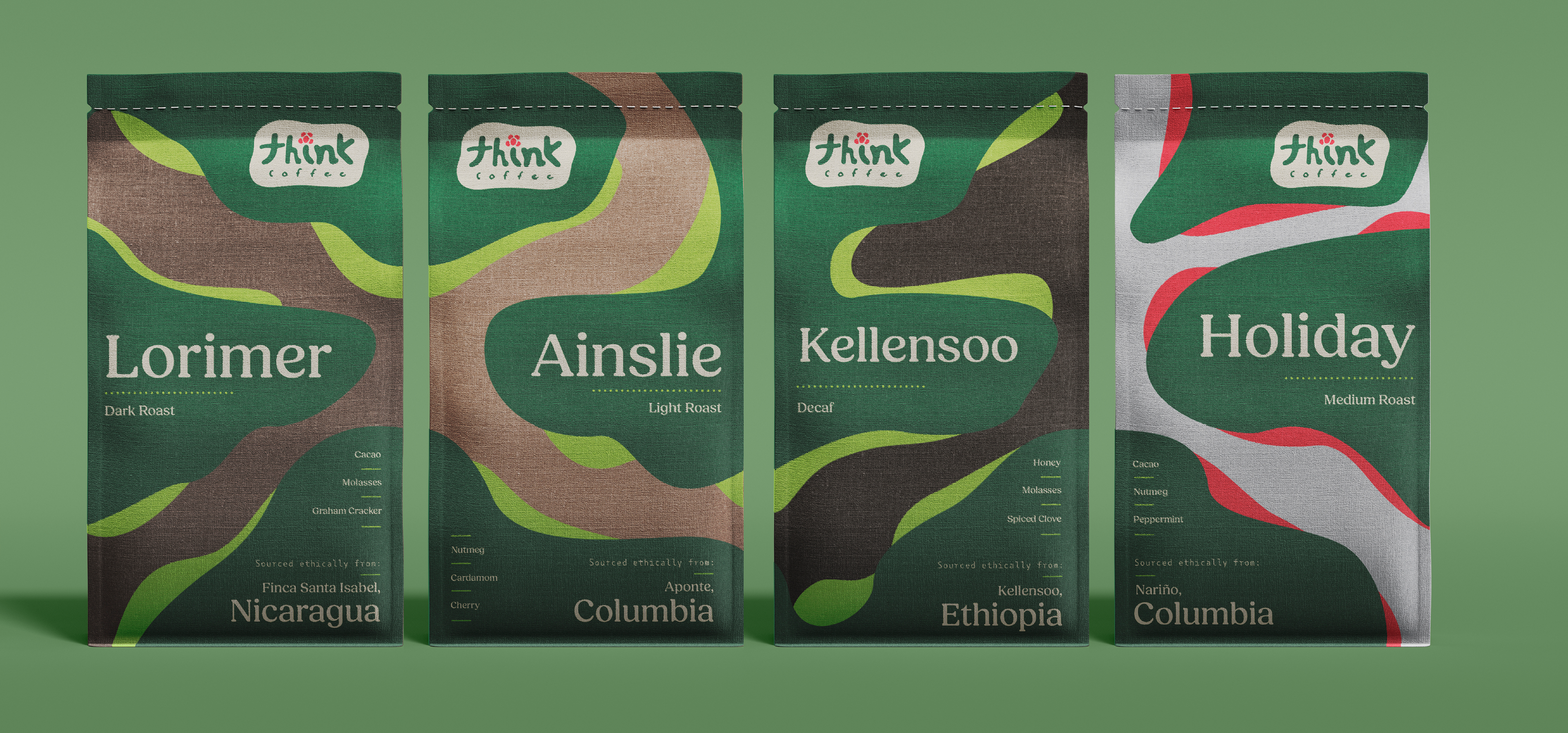
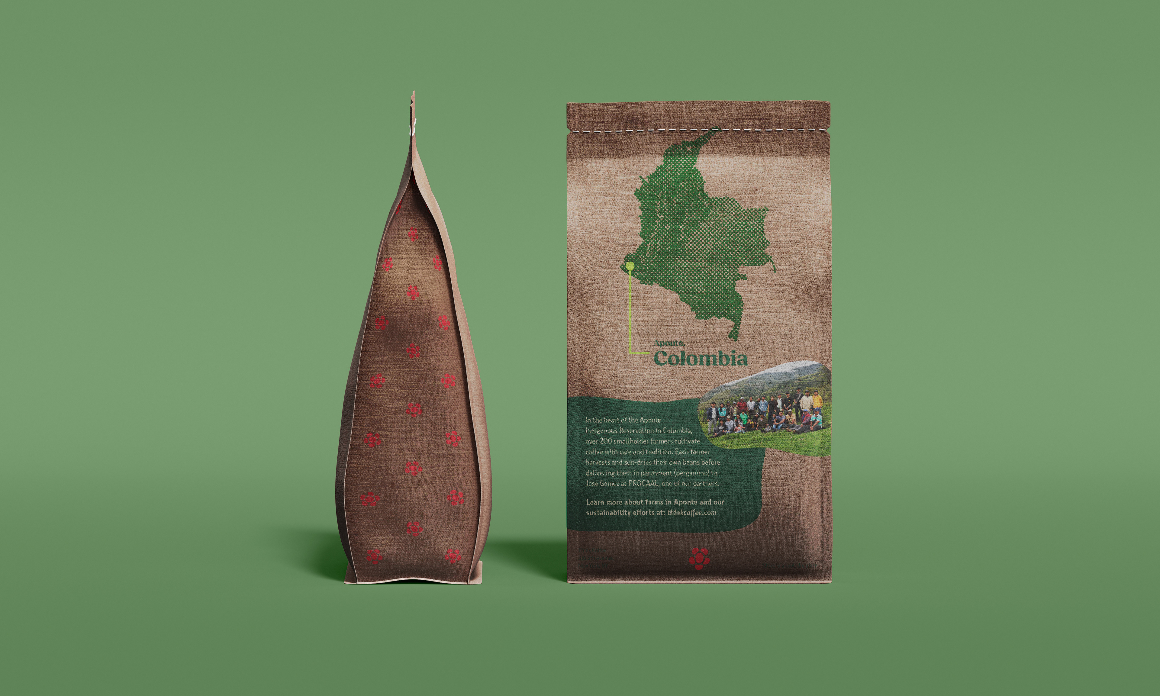
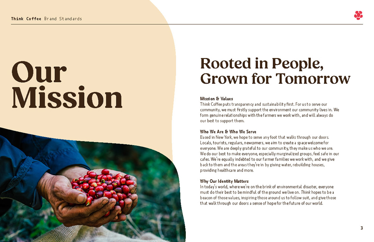
We had the option between two companies to rebrand, we chose Think Coffee of NYC because all of our personal ethics aligned with the brand. Before we started designing, we had to determine the future we were designing for. We decided that the world would be teetering on the brink of environmental disaster.
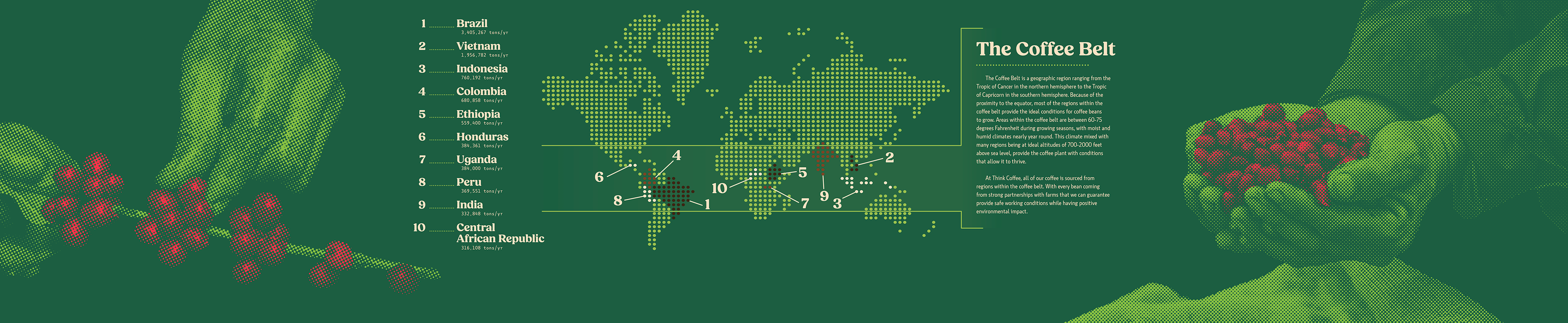
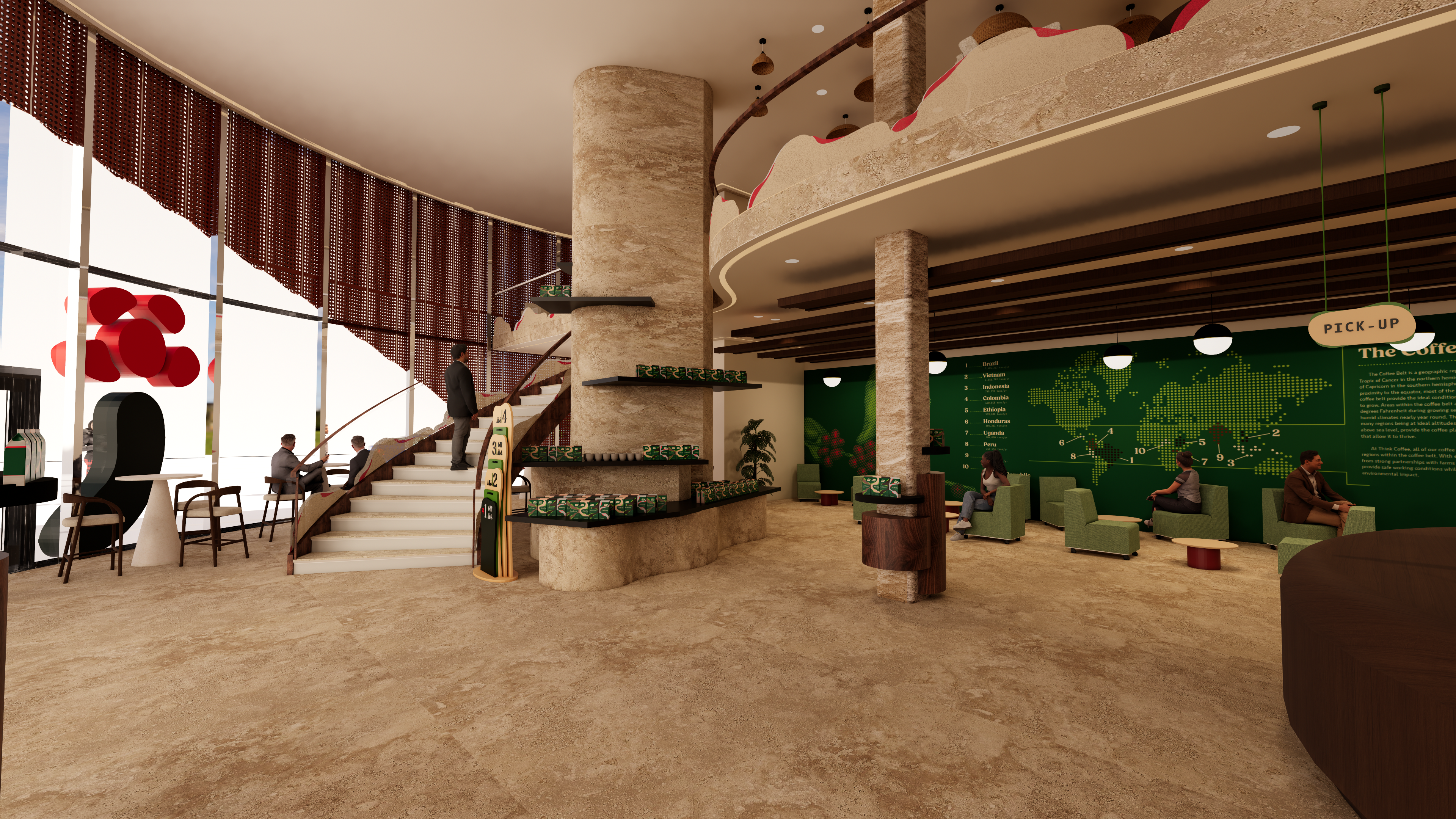
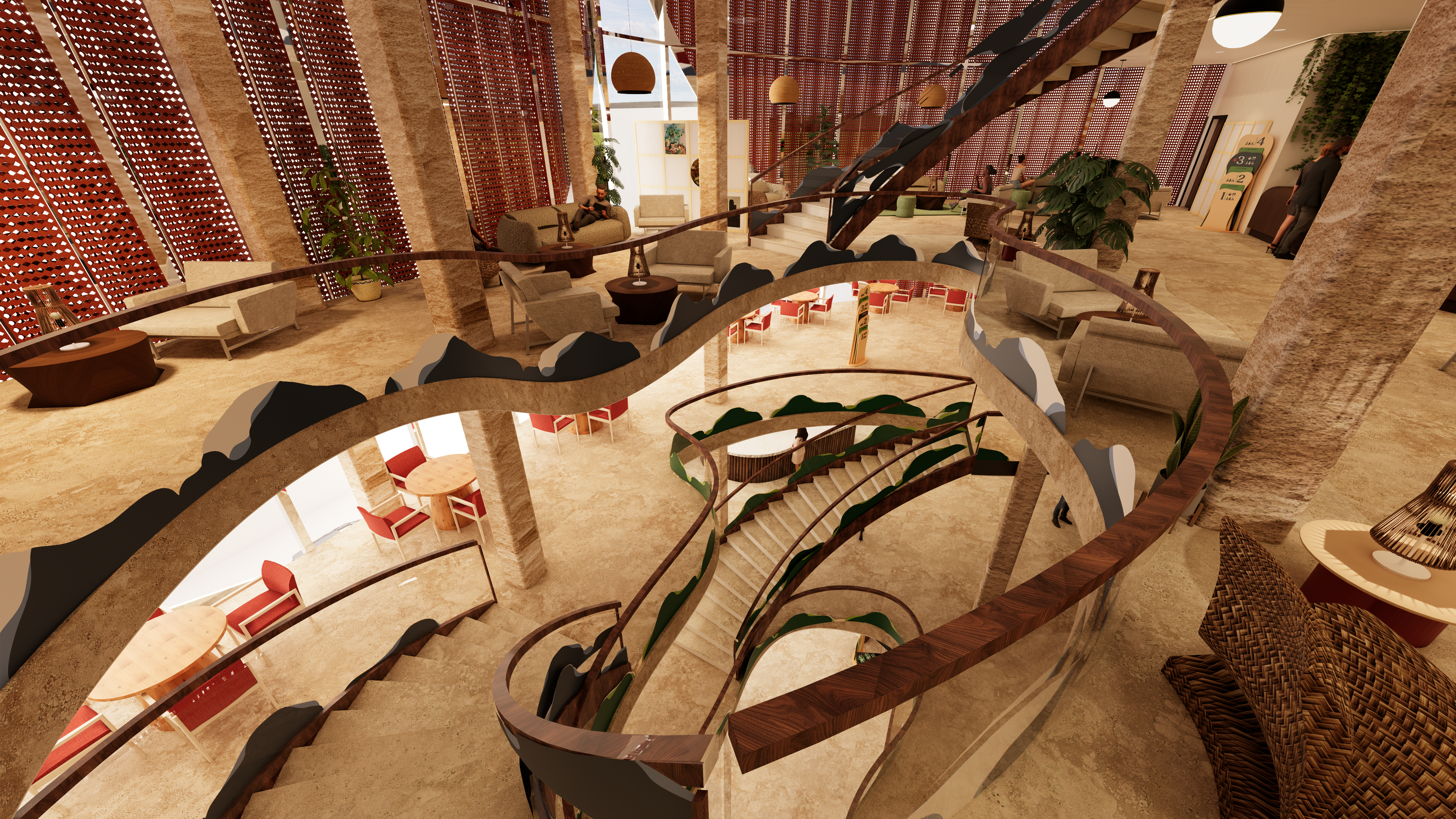
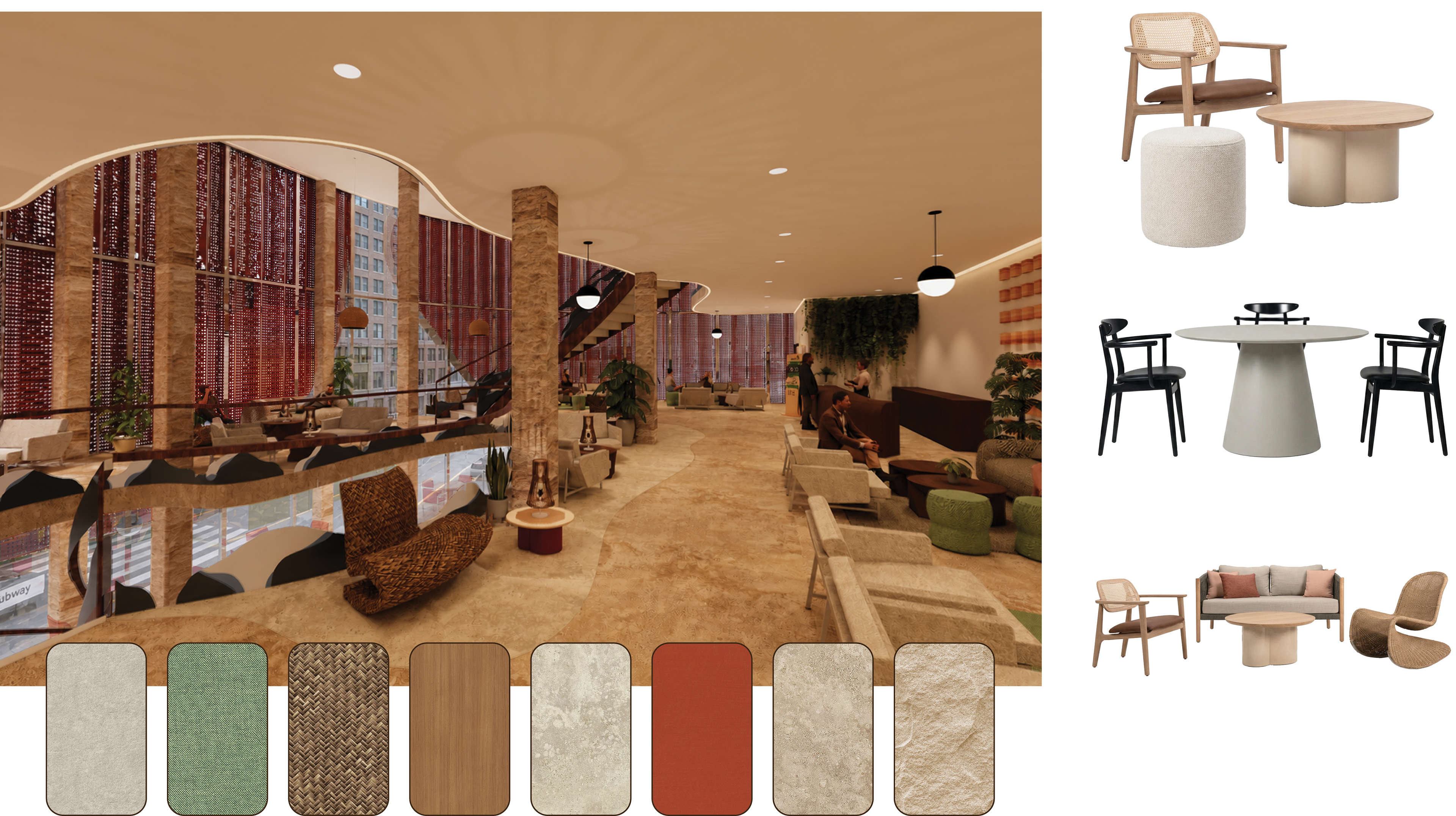
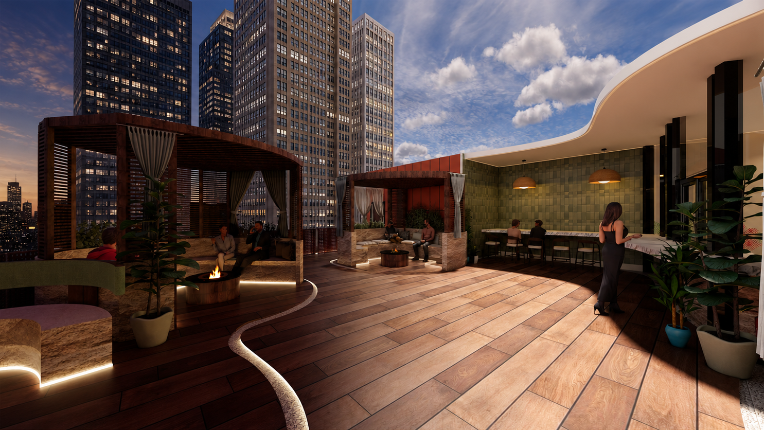
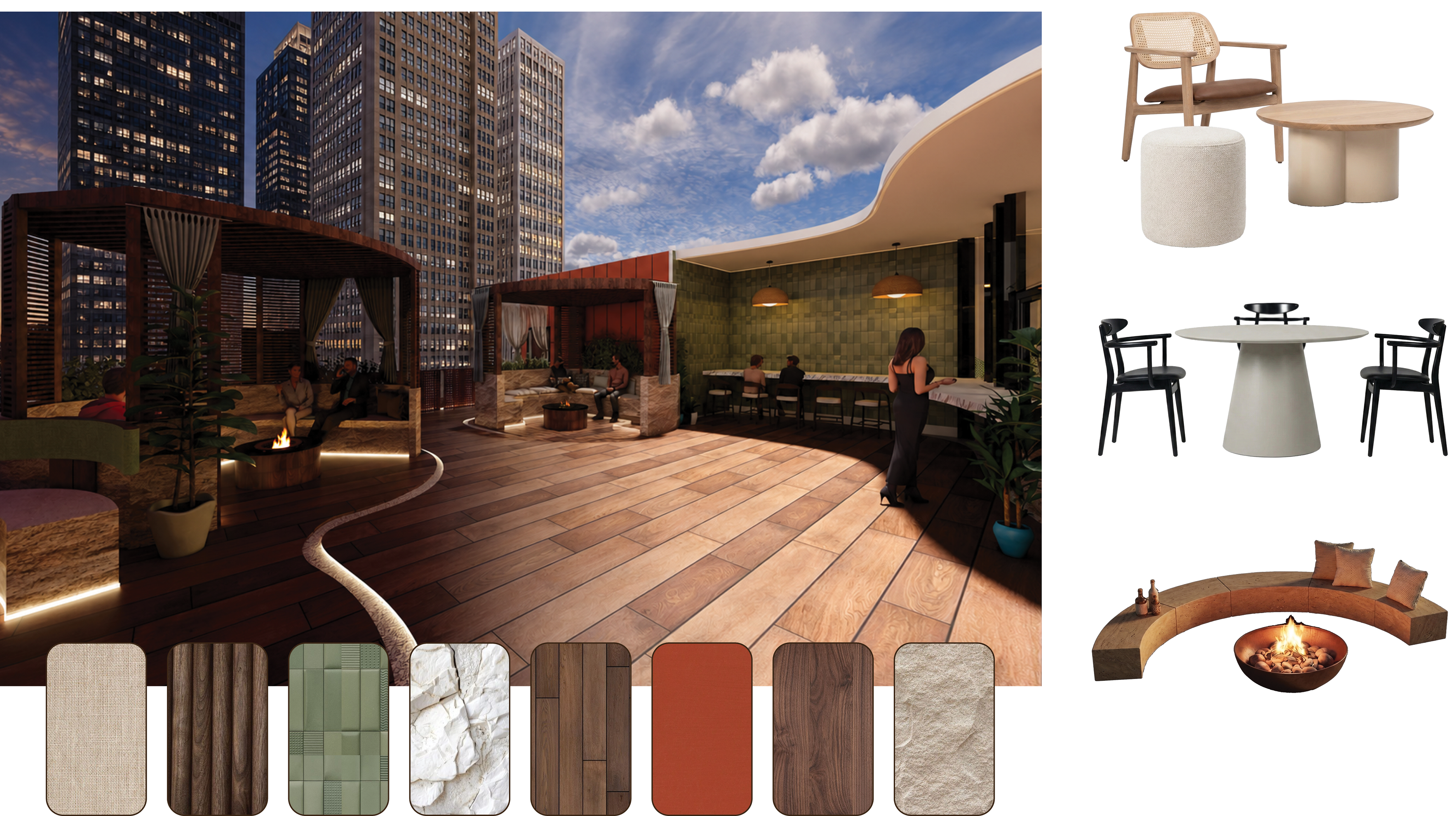
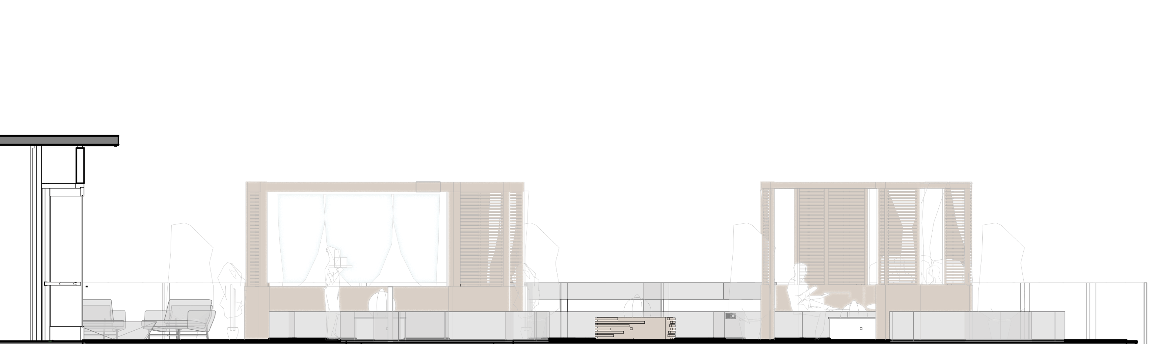
Think Coffee’s flagship redefines the “third place” as a restorative retreat within a hyper-connected, climate-impacted world. As society navigates growing resource scarcity and environmental instability, the space offers an intentional pause, inviting commuters, locals, and tourists to slow down, reconnect, and rediscover meaningful human interaction.
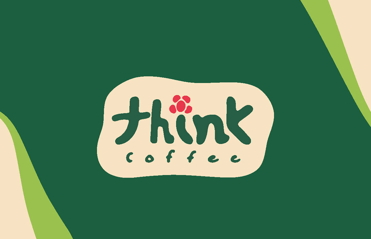
Logo System
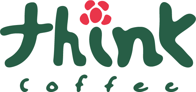
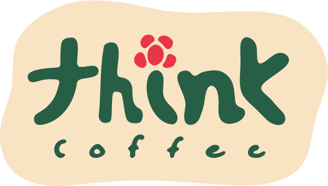

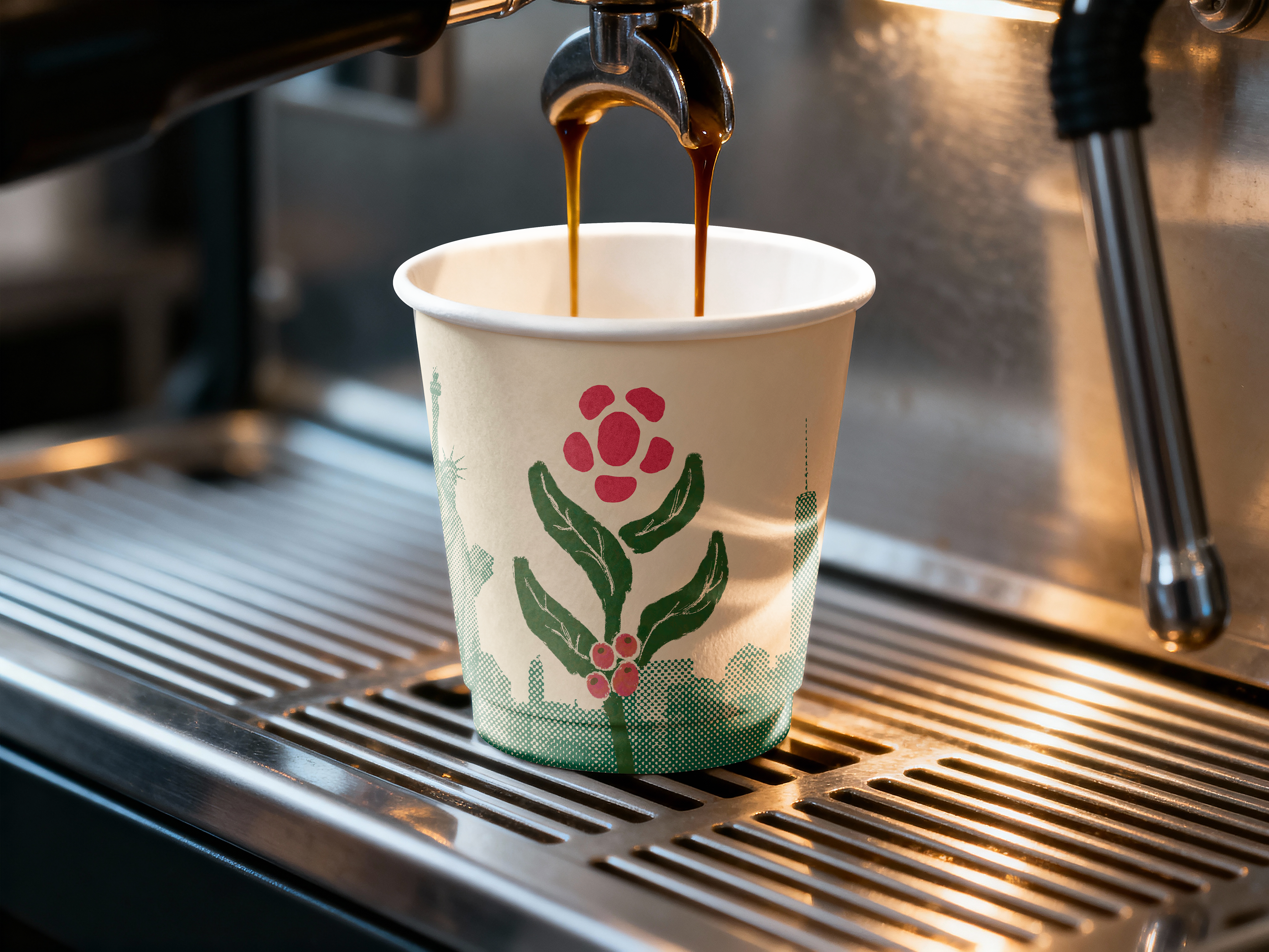
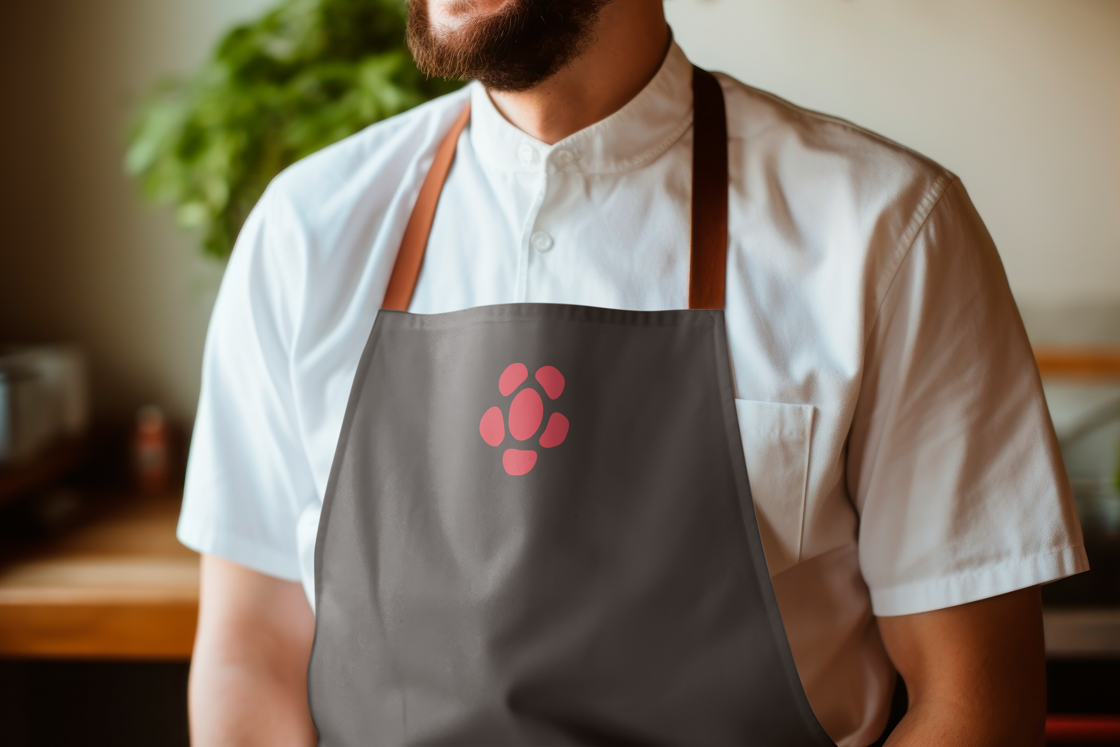
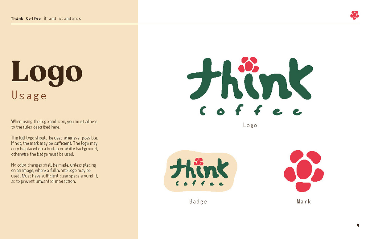
For the logo, we went with a handcrafted organic style to reflect the concept of the coffeeshop. We have three versions, all for different use cases. The icon reflects the coming together of community, with abstract forms representing a table and chairs, while also clearly being a flower. We play with this flower motif throughout the brand.
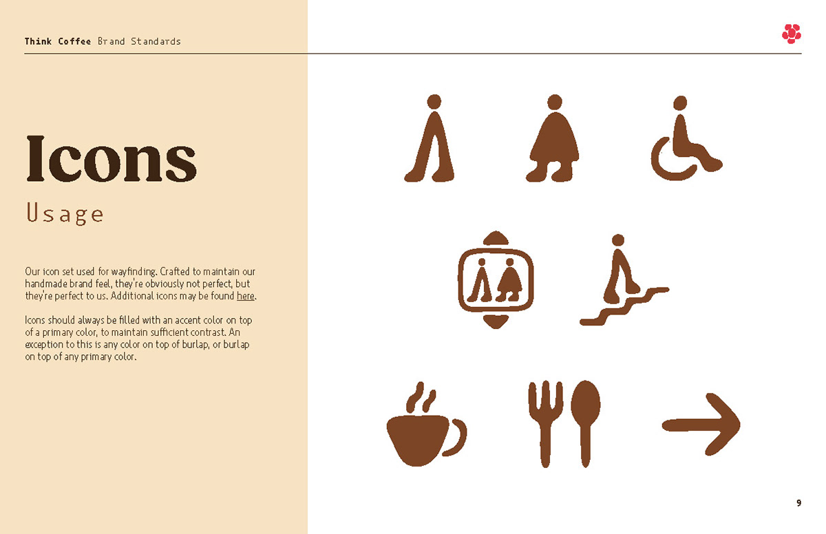
Icon Set
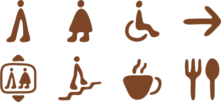
To go along with the logo, we created this icon set. We wanted to make them feel fun and inviting, so we went with bold, thick lines, and paired that with abstracted features. These icons shown here are used primarily for wayfinding, though they set the style for additional icons that would be needed.
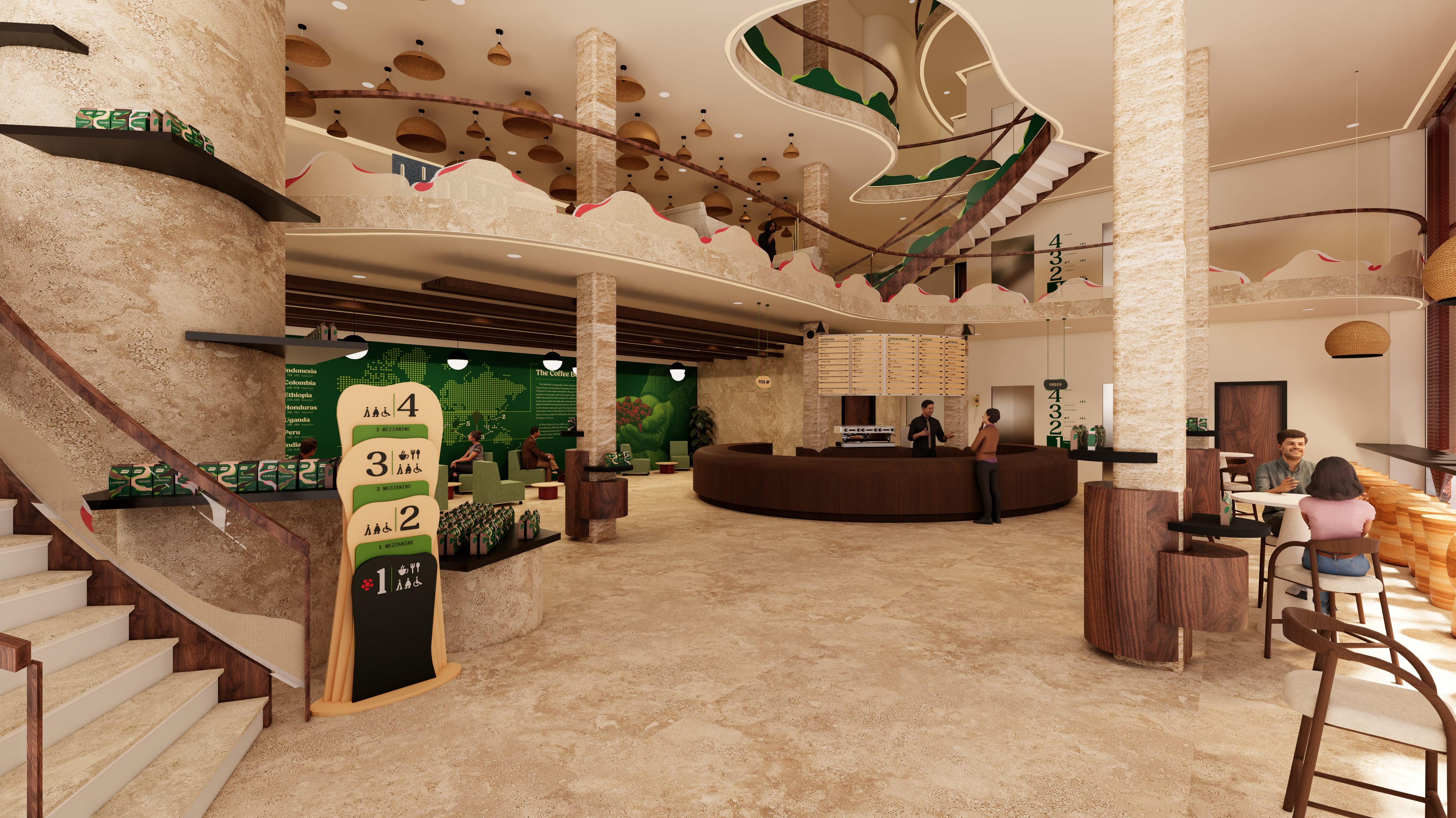
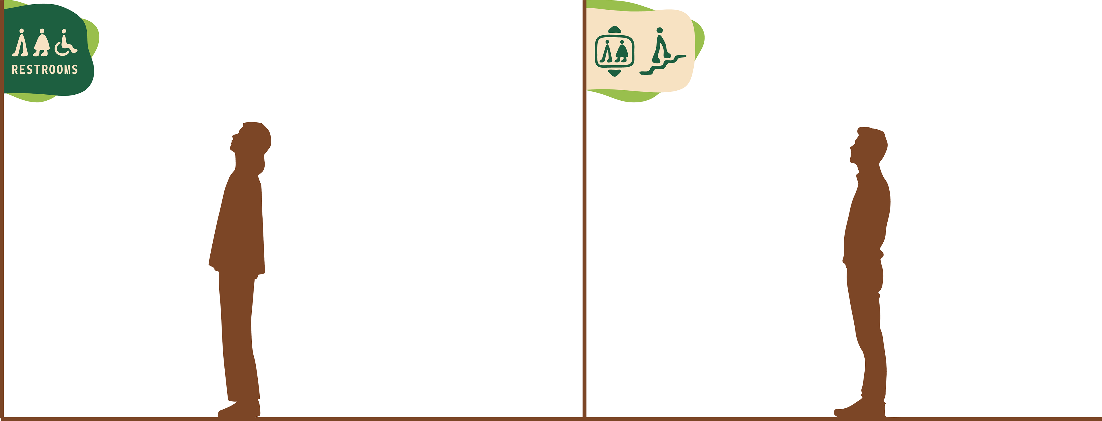
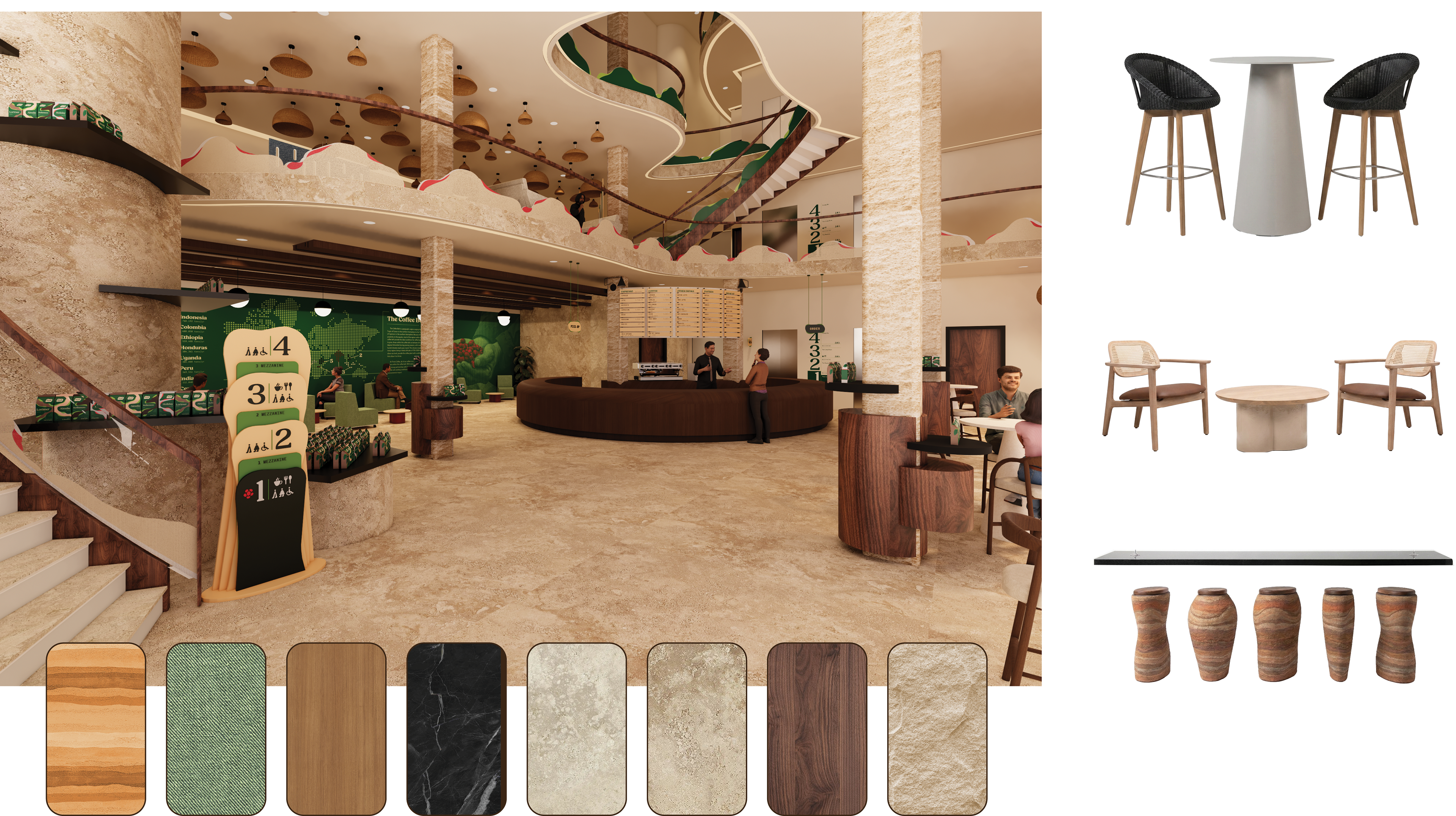
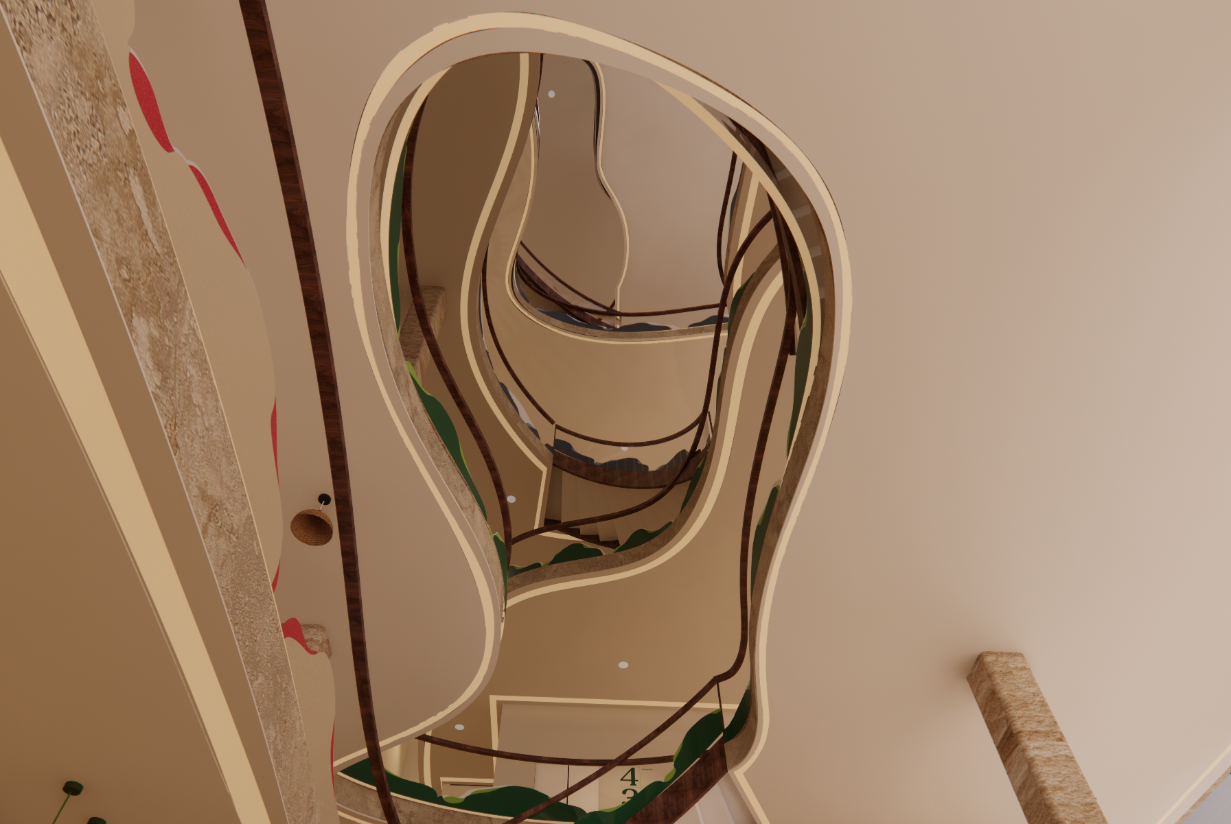
Wayfinding & Signage
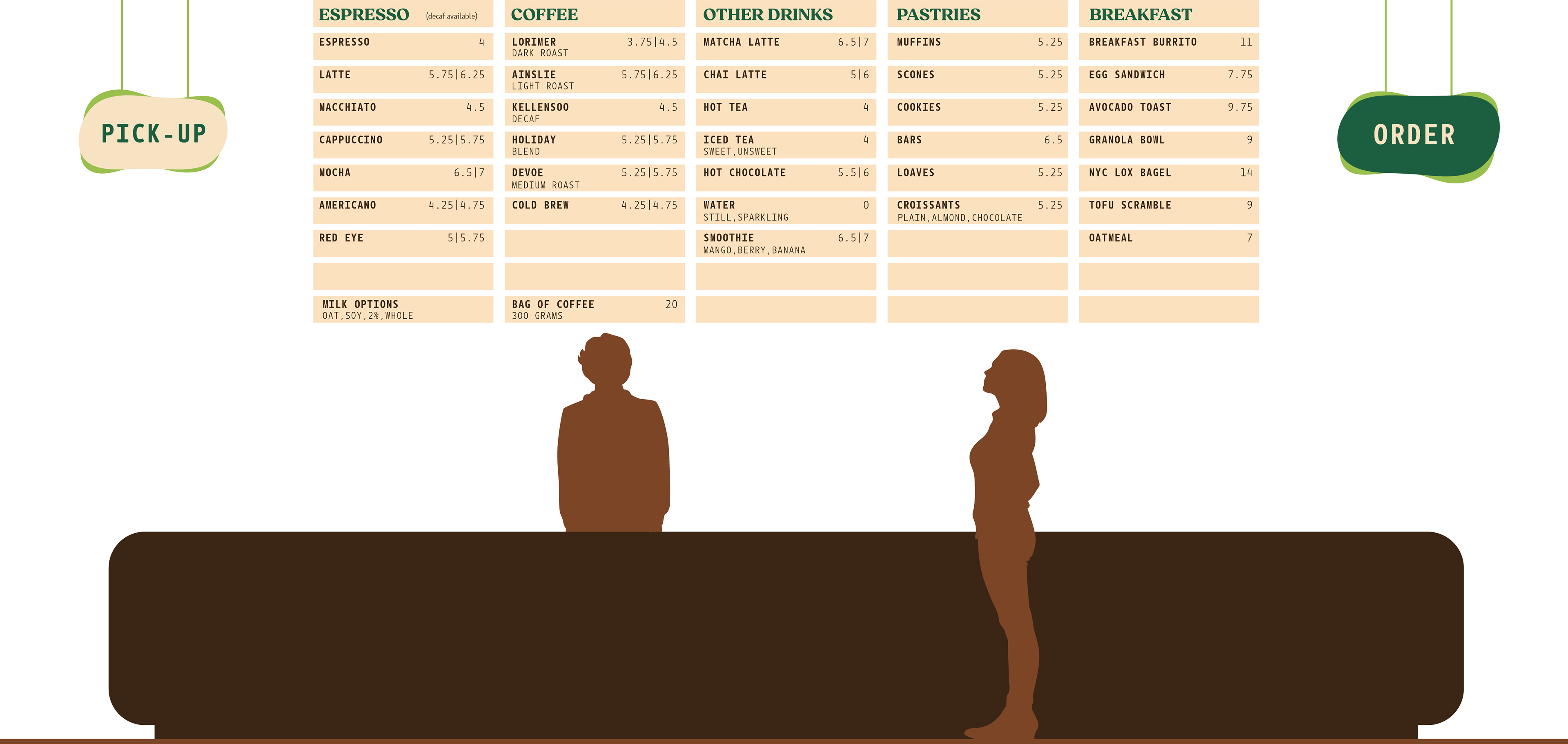
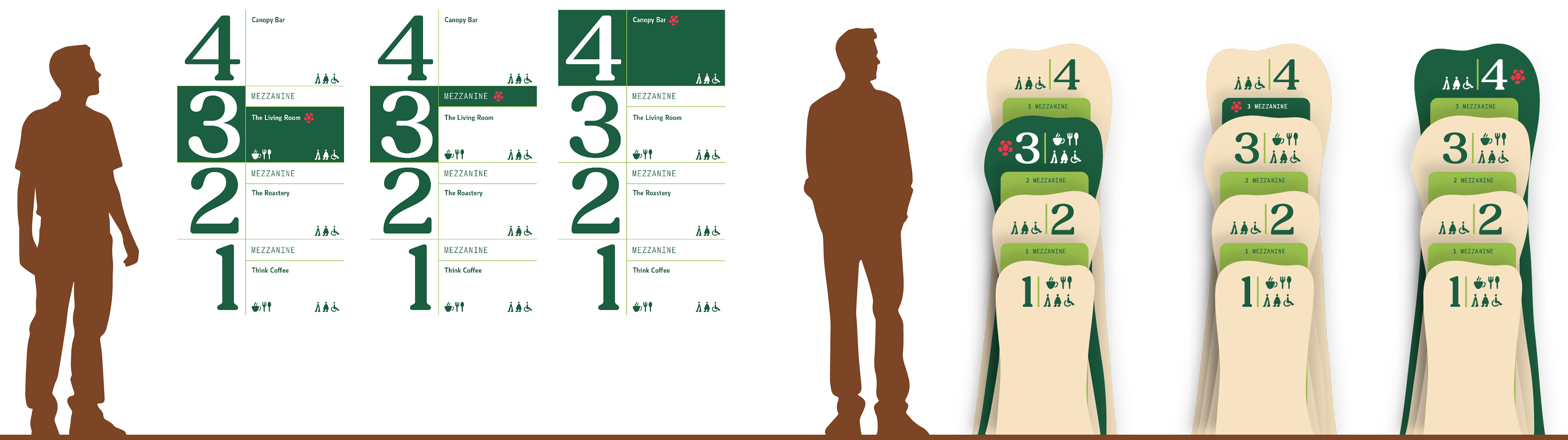
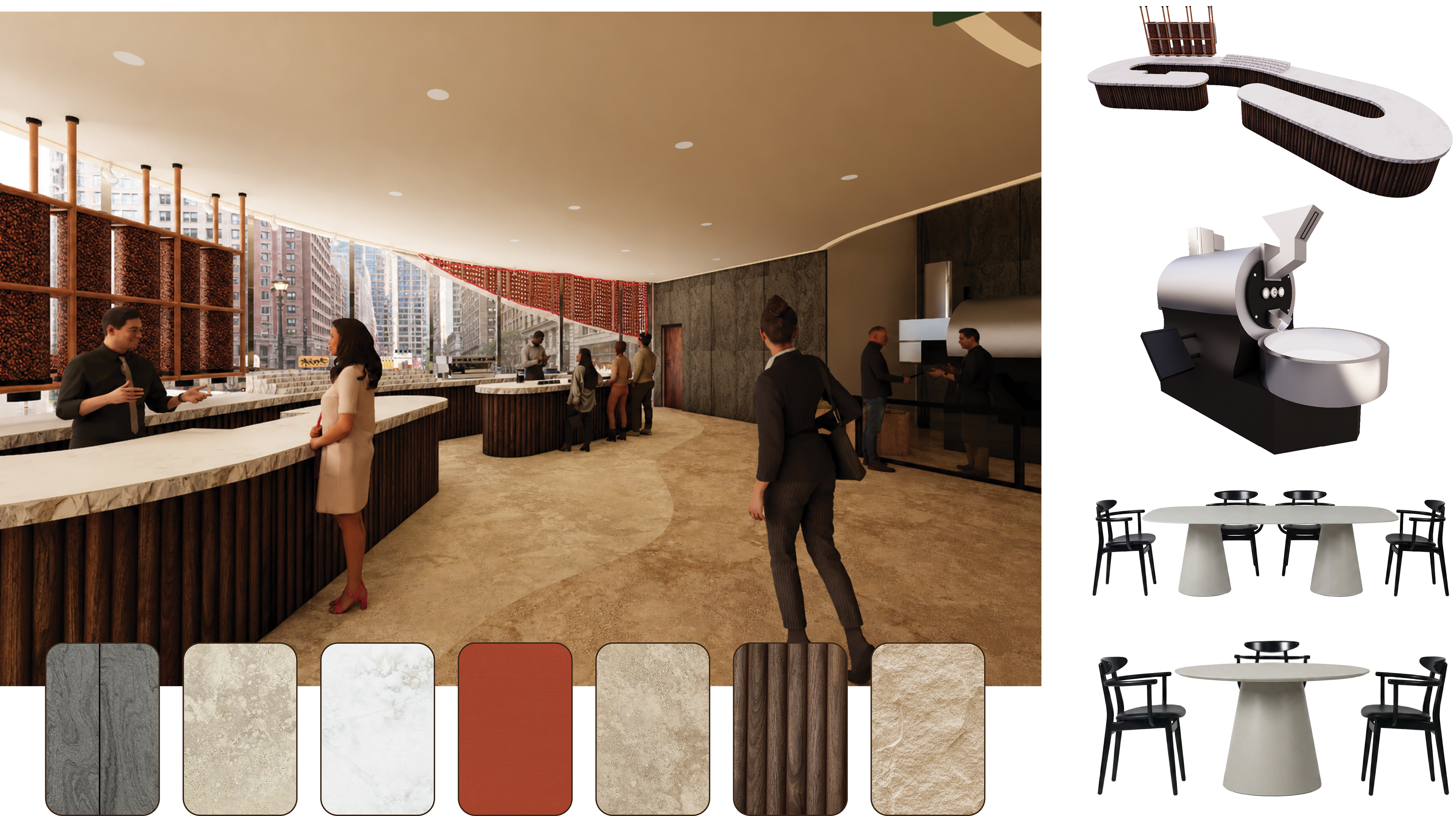
Since the cafe aims to have no visible screens, all of the wayfinding is physical. The menu is made of columns of wood slats. These slats can be pulled out and moved around or replaced. This modularity allows new items to be added, or special slats that are a different color for seasonal/limited items.
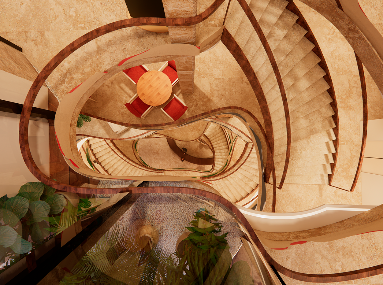
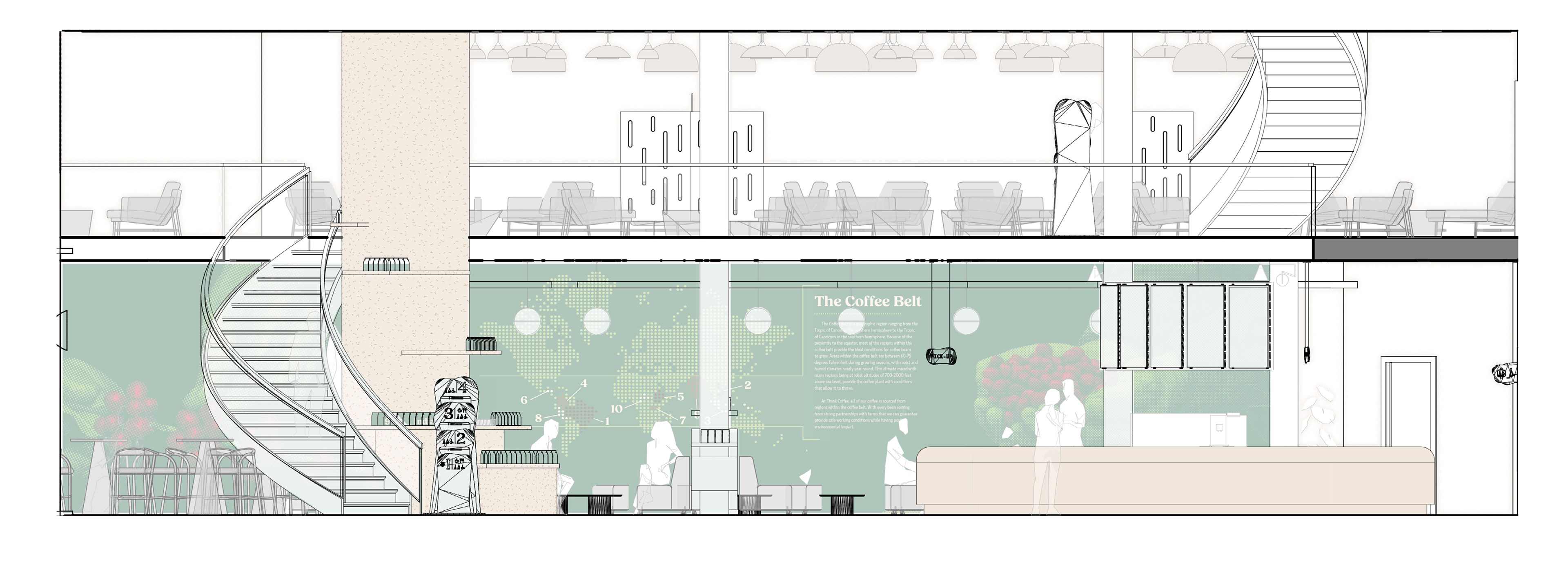
The wayfinding consists of three main types; decals, standees, and wall hangings. The decals are placed on the wall between the elevators and near the stairs. Standees are placed around the floors near the feature staircase, and are able to moved around. The wall hangings are placed higher up, directing customers to the stairs and restrooms from across the floor.
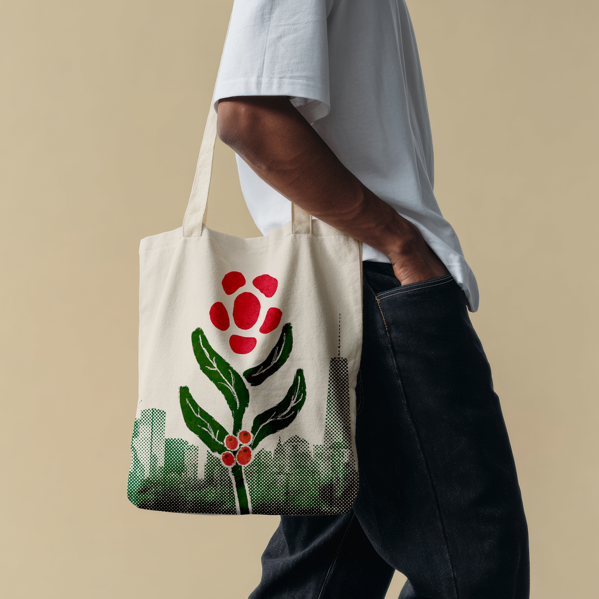
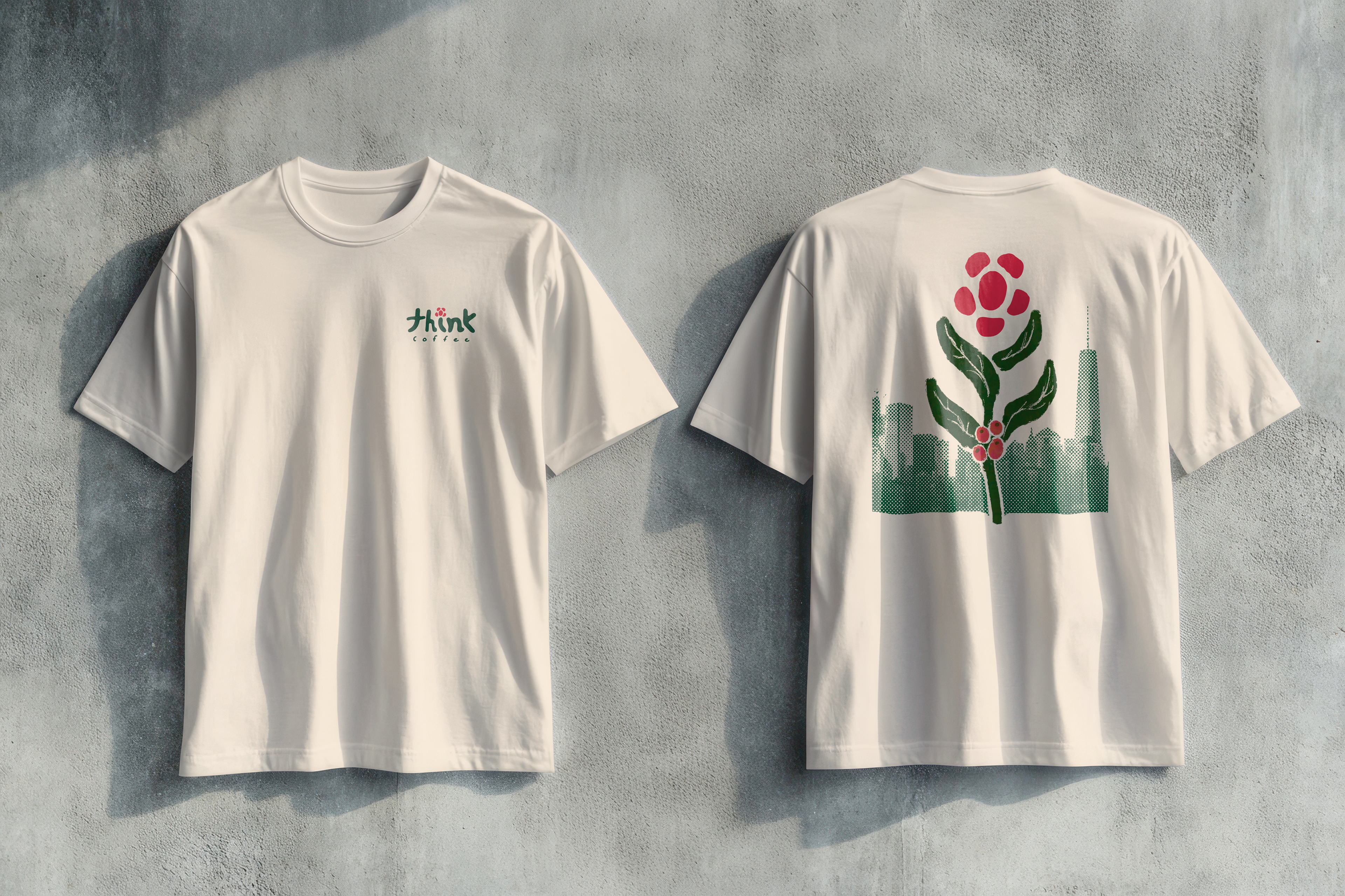
Merchandise
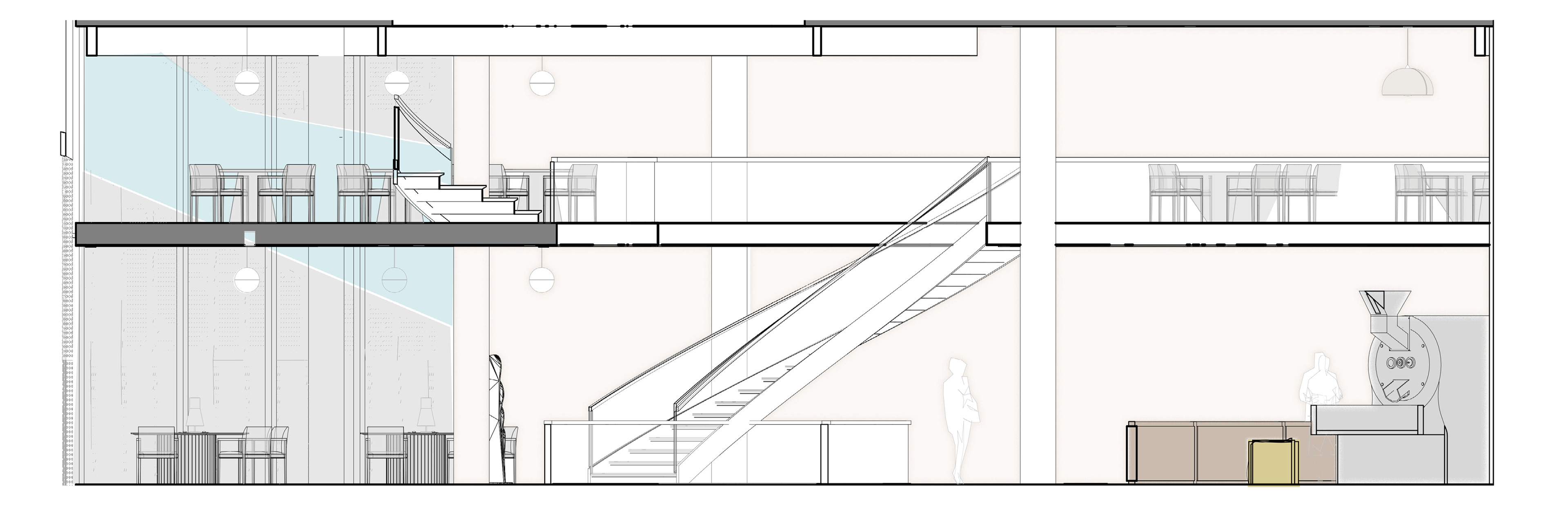
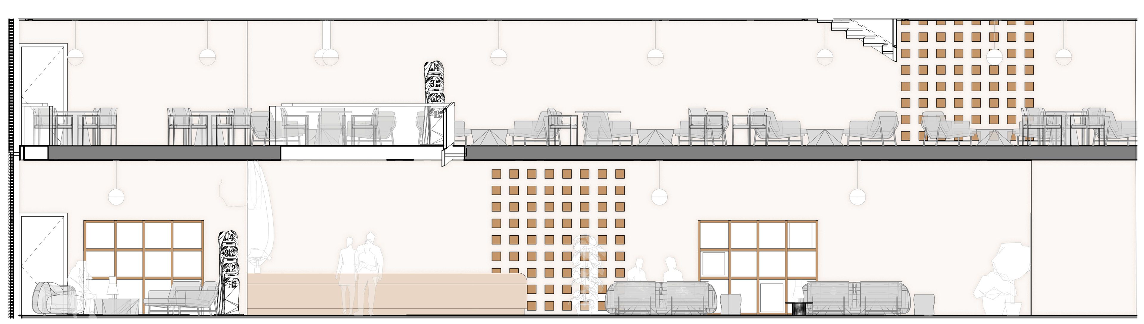
Building Tour
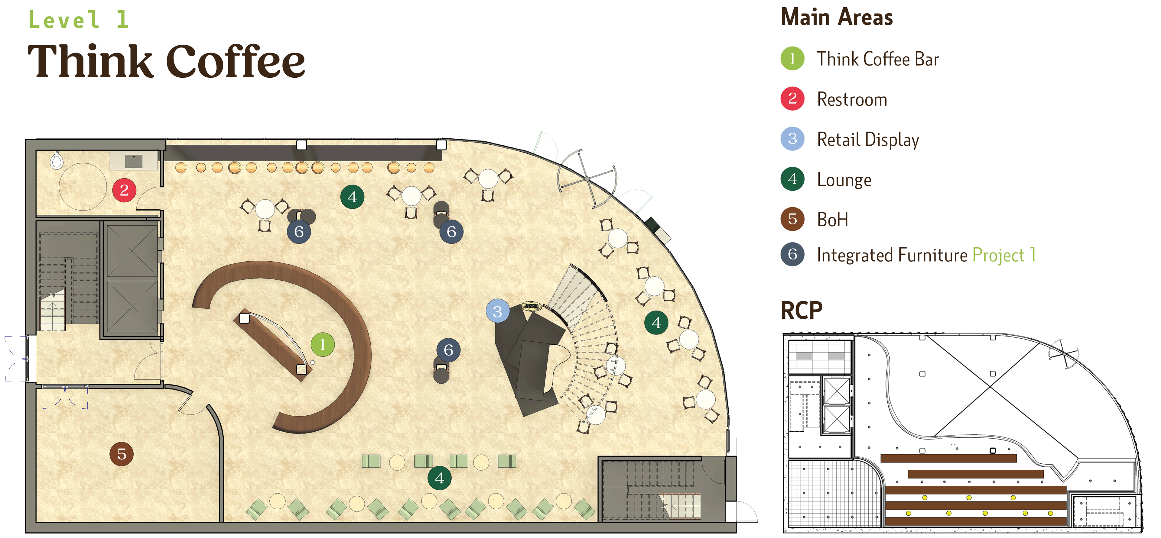
Level 1

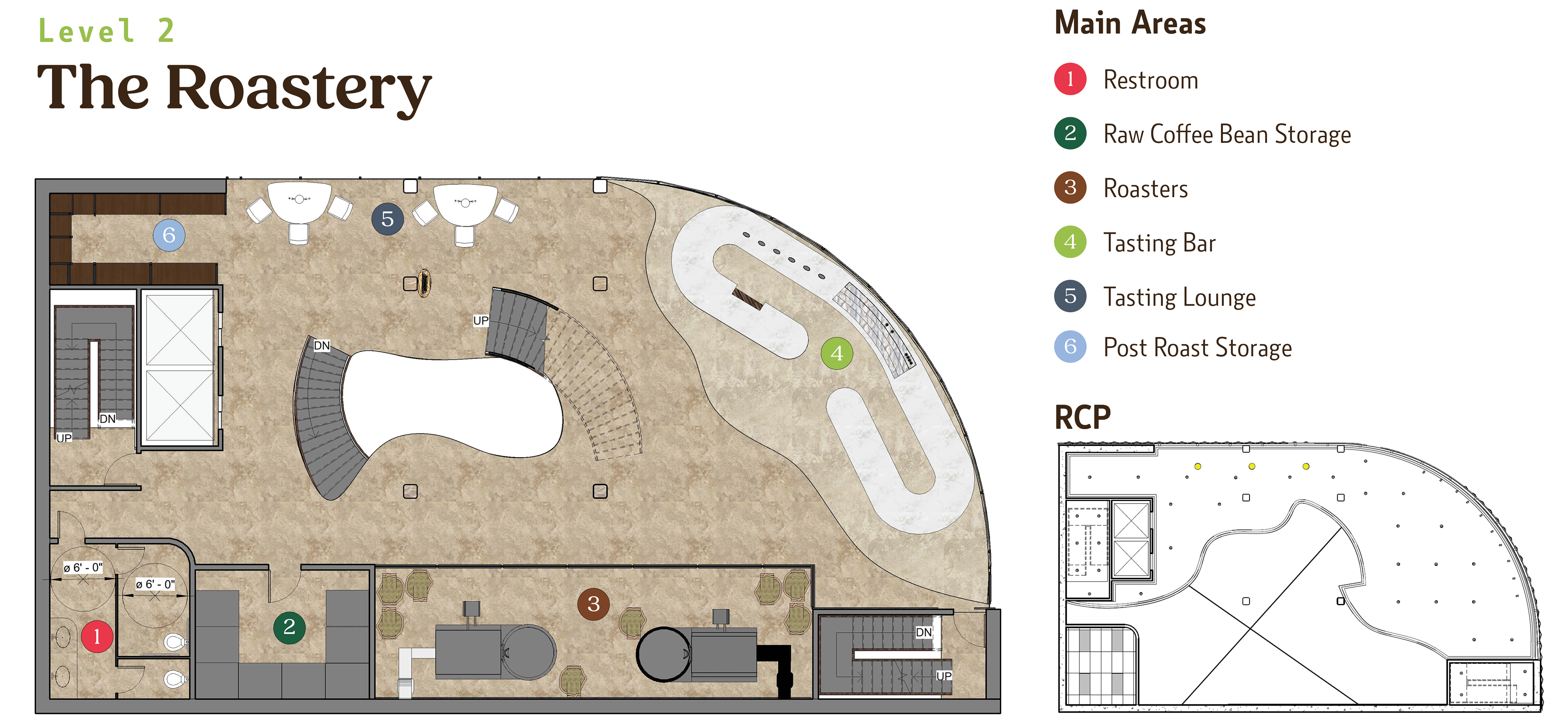
Level 2
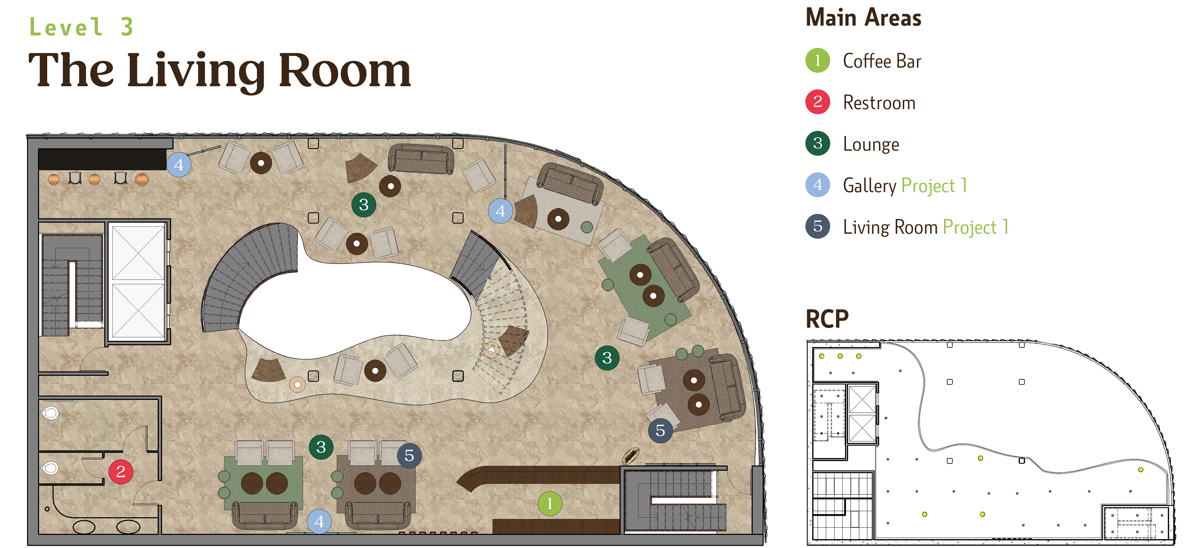
Level 3
Level 4
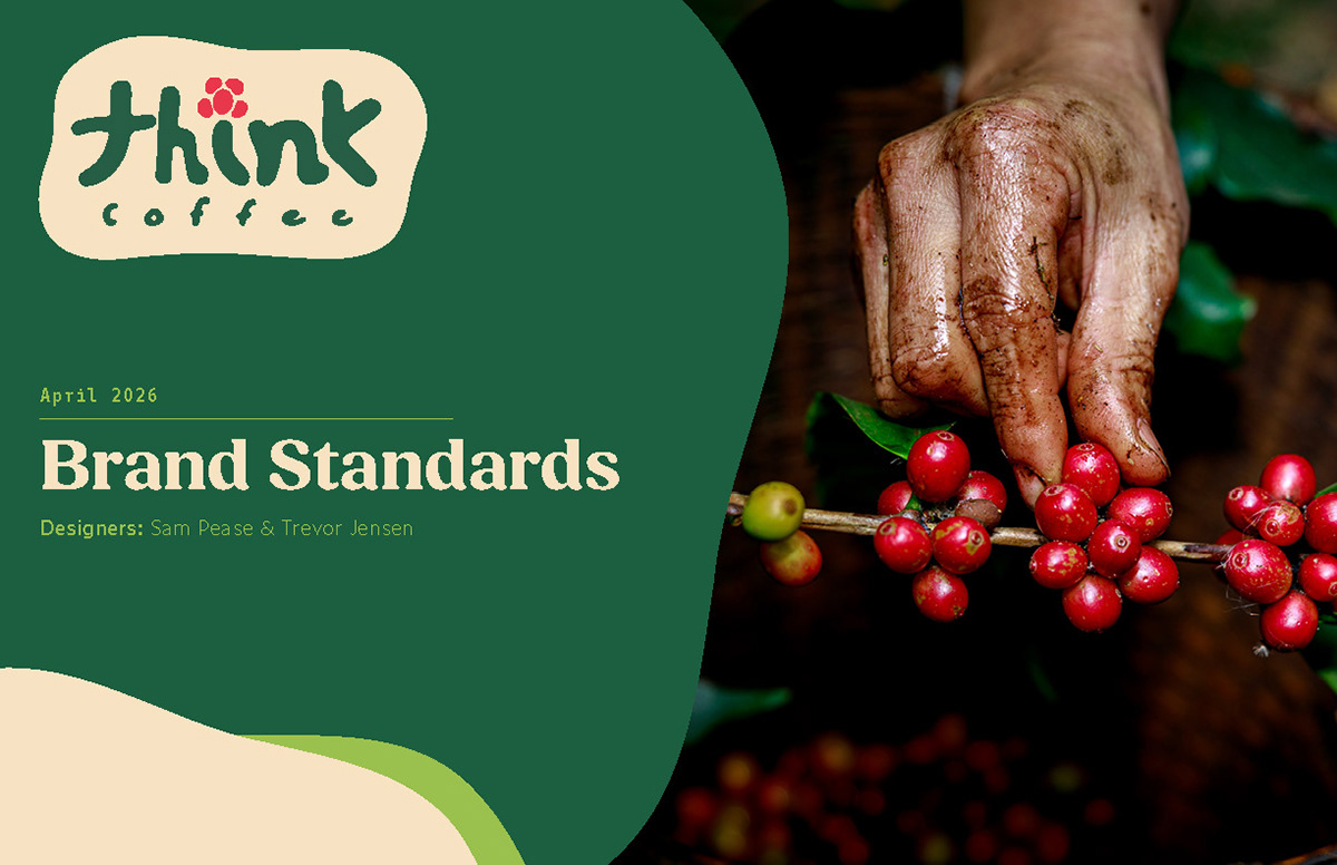
Brand Standards
Exhibition Posters